Use Internet Explorer to View This Site
|
Use Internet Explorer to View This Site |
|
January 29, 2000
|
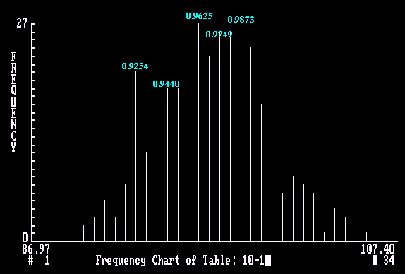
10-Day Cycle Frequency Chart of Euro The frequency is a quantified value assigned by the system to each bar. The difference in frequency values of two adjacent bars indicates the ease with which the market is expected to move between these two rates. The smaller the difference, the easier the movement.
10-Day Cycle probability Chart of Euro The probability value measures the pull which a projected rate exerts on the market. The likelihood of seeing a particular rate reached during any projected period is measured by a combination of two factors: the contour of frequency chart and its probability value.
Quantum Index Analysis The Quantum Index analysis is a new technical technique that I developed ten years ago. This technique is used to forecast the movement of currency rates, prices in bonds, stocks and precious metals. I provided exclusive service (Dollar/Mark, Dollar/Yen, Dollar/Swiss Franc and British Pound) to the Strategic Positioning Unit of Citibank in Hong Kong for two years (1988 - 1990). The system generates a bar chart for each of the above products. This chart indicates the ease of movement between projected chart points for a specific time frame. The system determines a projected range and number of bars to cover this range with a constant increment. The bars are arranged in ascending order along x-axis. A quantified value, frequency (y-axis), is assigned to each bar in the projected range. The difference in frequency value of two adjacent bars indicates the ease with which the market is expected to move between them. The smaller the difference, the easier the movement. The system also assigns a probability value (y-axis) to each bar. The probability value measures the pull exerted by each bar on the market. The likelihood of seeing a particular rate or price reached during any projected period is measured by a combination of two factors: the contour of the frequency chart and its probability value.
The best entry or exit point is at the extreme end of the normal trading range and can be fine tuned with a weekly chart. If you are interested in subscribing my weekly analysis, please check Services for more details or send me an e-mail. Albert Cheung (Ph.D.) E-mail: qindex@hotmail.com
Mirror Sites
|